5
astrum creative
2024
Services
- Digital
- Branding
Intro
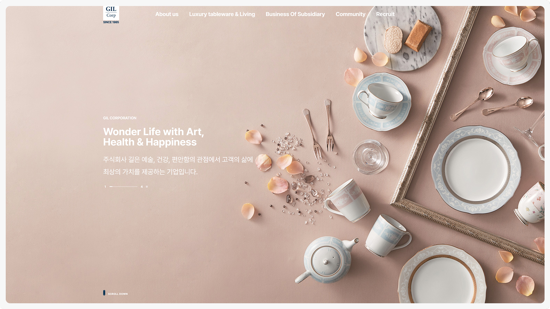
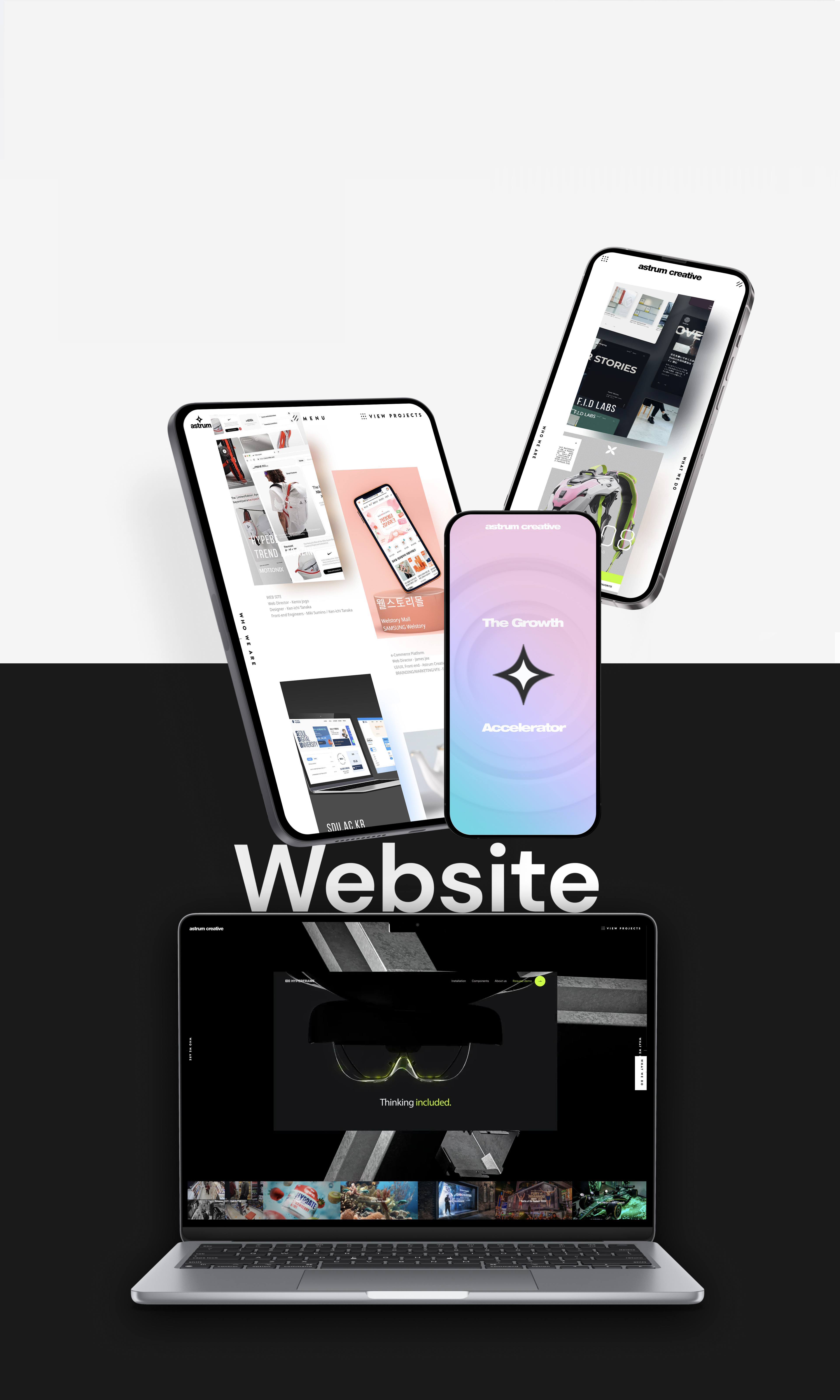
아스트럼 크리에이티브는 이커머스 브랜드/플랫폼 전문 디자인스튜디오 입니다. 다양한 업계의 초기 이커머스 진입과 브랜드 런칭에 필요한 디자인을 각각의 업계특성과 니즈에 맞춰 트렌드를 주도하는 서비스를 제공하고 있습니다.


The Symbol
For Opplio, we crafted a brand inspired by the full cycle of a workday, from sunrise to sunset. The brand symbol reflects this concept by blending colors reminiscent of both sunrise and sunset, symbolizing the entirety of the workday. This visual representation not only evokes the passage of time but also conveys the idea of completeness and continuity in work. The use of these colors in the brand identity reinforces the message of productivity and dedication throughout the day.
Overall, the brand captures the essence of a full day's work, embodying Opplio's commitment to supporting professionals throughout their entire work cycle.


Where Does It Go
In crafting Opplio's brand, we took a holistic approach, ensuring that every graphic element served a purpose and carried meaning. We began by deconstructing Opplio's logo and extracting individual shapes from its design. By meticulously dissecting the logo, we identified key elements that could be repurposed to create a cohesive visual language across all brand assets.
Additionally, we developed a supporting graphic pattern that drew inspiration from Morse code. This pattern not only complemented Opplio's logo but also served a dual purpose: supporting content visually while conveying a narrative relevant to the brand. Morse code, known for its succinct communication style, aligned perfectly with Opplio's mission of streamlining work processes and enhancing communication efficiency.


The User Interface
We translated Opplio's branding elements into a clean and intuitive interface design that resonated with the brand's principles. By maintaining visual consistency, prioritizing user experience, and integrating brand storytelling, we ensured that every aspect of the interface reflected Opplio's identity and values. The result was a cohesive and visually impactful user experience that aligned seamlessly with Opplio's brand.
Every element in Opplio's UI was meticulously crafted from scratch, ensuring a uniquely customized visual approach across all mediums. From buttons to icons and illustrations, each element was hand-drawn and tailored to fit seamlessly within the brand's aesthetic. This approach ensured a consistent and cohesive visual experience across various platforms and mediums, reinforcing Opplio's identity and message regardless of where users interacted with the brand. By prioritizing custom design, we maintained a high level of alignment and cohesion, enhancing Opplio's brand recognition and user engagement across all touchpoints.